|
It is already 10 years, I hear, since the Alligator mark painted on MOL's containers was created. Some time ago, Mr. Naomichi Korenori wrote the circumstances of how it came into being in an article of this Unabara. This time, I who just drew its mark have been named to write more about it. So allow me to intrude from outside the company into this in-house magazine.
Though not an MOL man, I have been associated with MOL since about 1948, and still remain a member of MOL fan club. I have had the honor of being appointed Honorary Captain, complete with the uniform and the cap. I was ordered to design a large poster of MOL's Brazil Maru and Argentina Maru when they stopped carrying emigrants solely and became passenger ships for the general clientele. Perhaps many people know that I draw pictures for the cover pages of MOL calendars and of monthly schedules issued by MOL's Tokyo Branch.
That long association of mine with MOL brought me the job of creating that Alligator mark. The direct client was Mr. Yasushi Okabayashi of the public relations team in the Administration Division. He is now administration general manager of Taiyo Ferry (now Meimon Taiyo Ferry). The direct users of the mark would be Korenori-san and his colleagues. He had been a close ship-happy friend of mine in the Kansai area since my college days. He then belonged to the Container Service Office.
MOL wanted something like the crane mark of Japan Air Lines. Certainly it is excellently designed. However, I am not a graphic designer as such but an illustrator whose job was to draw less abstract pictures. I was not sure if I could create a simple and yet good one like JAL's. I thought a mark something more visually familiar to its prospective viewers than an abstract symbol would be in my line.
 I belonged to the advertising department of Suntory, and had drawn pictures for advertisements. If you were to sell whisky which would pleasantly intoxicate the drinkers, you could use a very asserting, bold idea. But my new clients were different. They wouldn't usually advertise themselves too much, especially so when they handle cargo. The people working with MOL were more or less sober businessmen. Considering that atmosphere, I at first tried relatively modest designs. I took my themes from the mermaid, sailfish and flying fish. But my clients were not satisfied with these motifs. They wanted something more aggressive and an amphibious character, because containers were active both at sea and on shore. So we arrived at the idea of choosing the alligator. I belonged to the advertising department of Suntory, and had drawn pictures for advertisements. If you were to sell whisky which would pleasantly intoxicate the drinkers, you could use a very asserting, bold idea. But my new clients were different. They wouldn't usually advertise themselves too much, especially so when they handle cargo. The people working with MOL were more or less sober businessmen. Considering that atmosphere, I at first tried relatively modest designs. I took my themes from the mermaid, sailfish and flying fish. But my clients were not satisfied with these motifs. They wanted something more aggressive and an amphibious character, because containers were active both at sea and on shore. So we arrived at the idea of choosing the alligator.
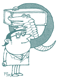
The common impression of the alligator is one of a rather dreadful animal, but we dared to use it as the basis of my design. After some study, I found that the crocodile, a kin of the alligator, is ferocious and disliked in other countries as well. On the contrary, the alligator is more gentle and seems to be well liked by people. As you would expect, I drew that mark to be as much like the alligator, not the crocodile, as possible. How is one different from the other? I knew the differences when I drew the mark, but I no longer remember them well. Perhaps the alligator has a rounder and larger nose and round humps on the back.
Anyhow, I worked out that design portraying the Alligator riding on an orange-colored life buoy and shouldering a silver container. The container at first was simply a silver rectangular box, which was condemned by Korenori-san as "looking like a coffin". So I drew it in full detail into what it looks now. The anchor tattoo on the Alligator's arm is dandy, isn't it?
As I said, the secret of its success lies in the use of the alligator which was dreaded according to commonsense. I was impressed with the good sense, and changed my view, of the public relations team who adopted the bold, daring theme in spite of the lesser emphasis a shipping company would usually place on advertising.
The outcome was, as I had expected, something quite different from JAL's crane symbol, but if I may flatter myself a little bit, isn't the Alligator more humorous, amusing and human than the crane? ScanDutch's vermilion screw is quite a smart design from a professional point of view, but it does not look so familiar to people in general. A neat design is not necessarily an effective one.
Let me take this opportunity to introduce some of the other marks I designed for the MOL group. The corporate mark of Taiyo Ferry combines the Chinese character for "dai" (big) and "nami" (waves). I designed it when the company was set up. The picture of the comet for the Orion and Pegasus also is my work at the time of their debut. The Neptune mark used by Nihon Enkai Ferry is another, and the corporate symbol of Shosen Mitsui Kosan is one of my latest works.
Prospective clients who have noticed the Alligator mark on containers come to me once in a while and ask me for something like that, but I find it difficult to create anything surpassing that. I think MOL's staff who motivated me to create the Alligator were wonderful people. My suitcases and other travel items all bear the Alligator stickers, which are very convenient to identify them with me.
The Alligator mark is a great favorite of my own, and I think it is one of my masterpieces. My friends at MOL, please do continue to love him forever.
|
